

Chapter 9 - Charting Data
Being able to visualize data can have a tremendous impact on the reader. Compared to just printing raw numerical data, adding a chart to a report makes it possible for readers to quickly grasp the important relationships between data. Many times reports are used with proposals to sell a reader on an idea or plan. Adding a colorful chart can sell your idea more effectively than a dry report filled with endless numbers. This chapter shows you what types of charts are available as well as how to modify their appearance so that they can make your report more appealing and quickly get your message across.
 Become a Crystal Reports expert with the authoritative resource available.
The tuturials and tips in this book will take your skills to the next level.
Become a Crystal Reports expert with the authoritative resource available.
The tuturials and tips in this book will take your skills to the next level.Buy at

More Chart Formatting Options
The Chart Expert is the primary place where you create the type of chart to display and set the way it looks. However, Crystal Reports gives you additional ways to format charts at a more granular level. After inserting a chart onto a report, you can right-click it to see the options on the pop-up menu. The two menu options we are concerned about are Format Background and Chart Options.The Format Background option opens the Format Background dialog box. This dialog box, shown in Figure 9-12, gives you a multitude of ways to change a chart's background. This ranges from changing the color, setting a pattern, or even using a picture in the background.
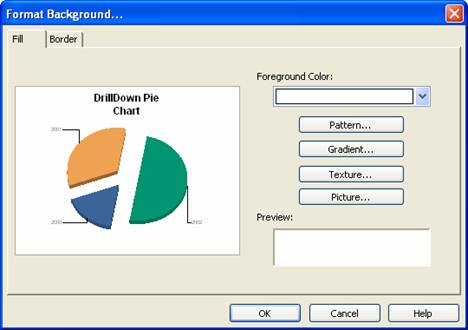
Figure 9-12. Changing a chart's background with the Format Background dialog box.
The Format Background dialog box has two tabs. The first tab, Fill, sets how the background is filled. This can be solid color, a colored pattern or even a picture. By clicking on each of the options to the right of the dialog box, you are given a wide selection of choices. When clicking on the Foreground Color drop down box, a palette of colors appears and you pick the color you want. When clicking on the pattern button, it shows you a variety of patterns (e.g. cross-hatch, angles, bricks, etc.) to choose from. Again, pick the one you want to use on the chart. As you make your selections, the chart is updated to show a preview of the effects. Do this with the other options until the report has the look you want to stick with.The second tab, Border, is more simplistic. It lets you set whether a border is shown around the chart's edges. If so, you can set the color, thickness and style.
Another dialog box is available for changing the details of how a chart is displayed. Right click on an existing chart and choose the Chart Options dialog box (shown in Figure 9-12).
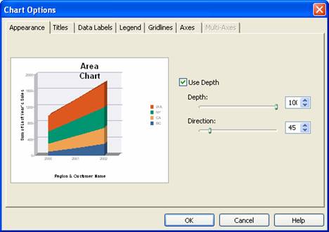
Figure 9-12. The Chart Options dialog box.
The Chart Options dialog box uses tabs running along the top to categorize the types of options to change. These tabs change based upon the type of chart being modified. Not only do the available tabs change, but the selections within each tab also change based on the chart type. For example, the Appearance tab for a pie chart has options to change the display angle, the gap between areas, and how far apart each area is from the center. But the Appearance tab for a bubble chart only sets the size of the bubbles and their shape.Due to the wide number of tabs that can be displayed and the number of variations within each tab, I leave it up to you to fully explore each tab for the chart you are working with. After creating a chart, just open the Chart Options dialog box and click on each tab to see what is available. As you make changes, the preview reflects the new changes. If you just want to play around with the different choices, then remember to click the Cancel button when you are finished so that the changes don't get saved.
To read all my books online, click here for the Crystal Reports ebooks.