

Chapter 9 - Charting Data
Being able to visualize data can have a tremendous impact on the reader. Compared to just printing raw numerical data, adding a chart to a report makes it possible for readers to quickly grasp the important relationships between data. Many times reports are used with proposals to sell a reader on an idea or plan. Adding a colorful chart can sell your idea more effectively than a dry report filled with endless numbers. This chapter shows you what types of charts are available as well as how to modify their appearance so that they can make your report more appealing and quickly get your message across.
 Become a Crystal Reports expert with the authoritative resource available.
The tuturials and tips in this book will take your skills to the next level.
Become a Crystal Reports expert with the authoritative resource available.
The tuturials and tips in this book will take your skills to the next level.Buy at

Customizing the Chart Axes
In most cases, the default formatting of the X-axis and Y-axis will be fine. But there are times when you will want to customize the axes to fit your reporting requirements. You can do things like turn the gridlines on or off, set the minimum and maximum value ranges, and set the formatting of the data values. The Axes tab, shown in Figure 9-11, on the Chart Expert gives you many options for making these changes.
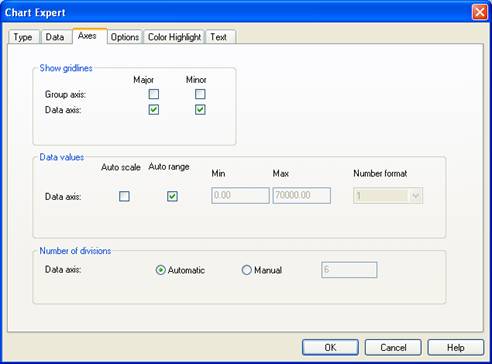
Figure 9-11. Customizing a chart's axes.
The Axes tab is broken into three sections. Each section controls a different part of the chart. The Show Gridlines section determines which axis the gridlines are shown at. They can be displayed along the major or minor axes. The type of chart you are displaying determines which gridlines are available.The Data Values section sets the labels along the axis. The Auto Scale option is used when there are so many labels to display that they become hard to read. Turning this option on decreases the number of labels and this makes them easier to read. The Auto Range option sets a default range by evaluating all the possible values being charted. You can set the range by un-checking the Auto Range option and setting the minimum and maximum values manually. The Number Format drop down box lets you specify the number of decimals and whether the value should appear as a number, currency or percentage.
The Number of Divisions section sets the number of divisions along the data axis. You can set the Manual option to increase or decrease what Crystal Reports calculates to be the optimal number.
To read all my books online, click here for the Crystal Reports ebooks.